EBOOST
Clean fuel for the bold.
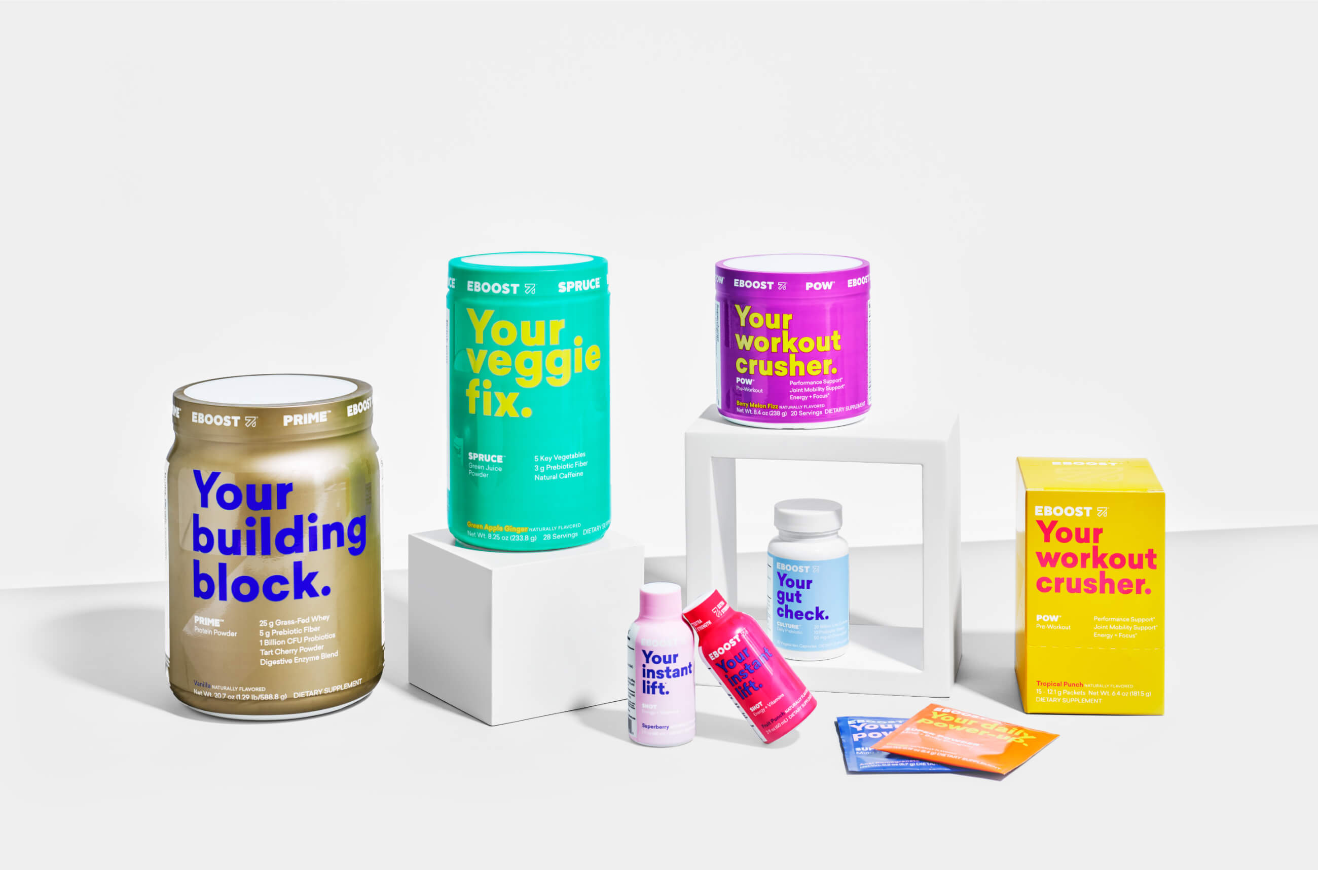
Getting clean energy and vitamins is important, and Eboost makes it easy. They came to us with the challenge to design a brand that spoke clearly to their customers, educating them on how and when to use each product. Our solution? Creating content-driven packaging that lets the benefits do the talking.
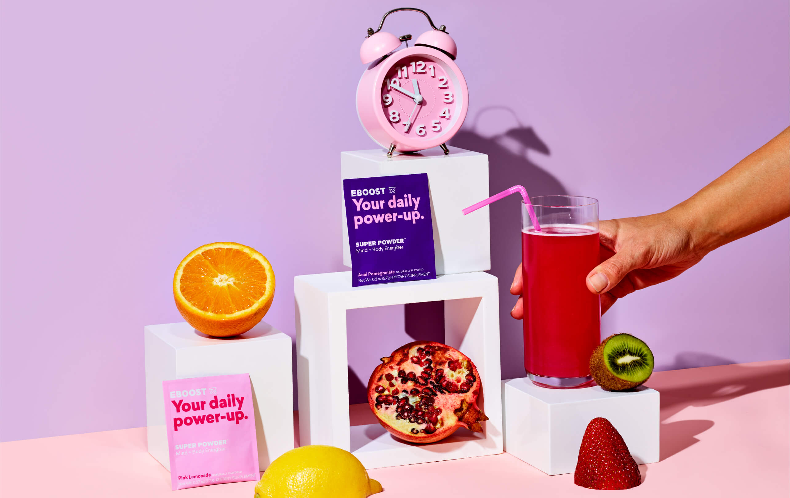
We created a bright, iconic brand that reflects the energy of Eboost’s offerings and stands out among other products.
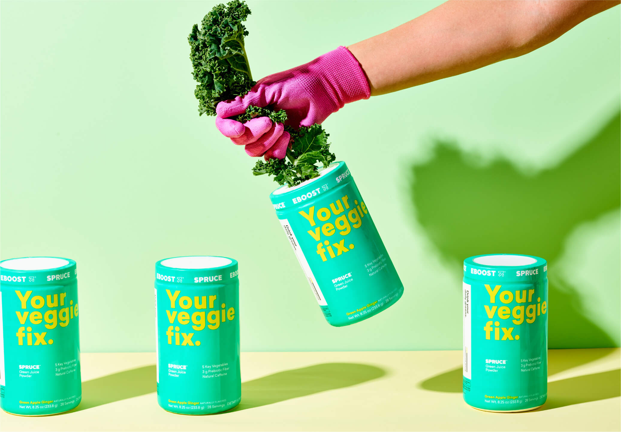
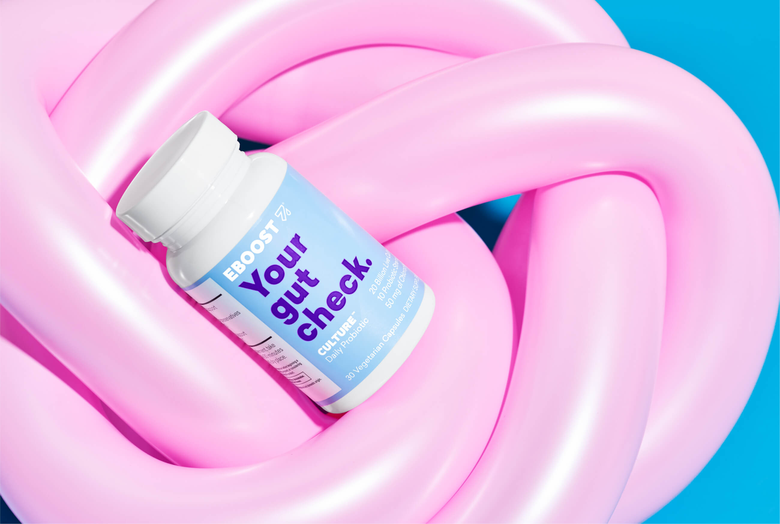
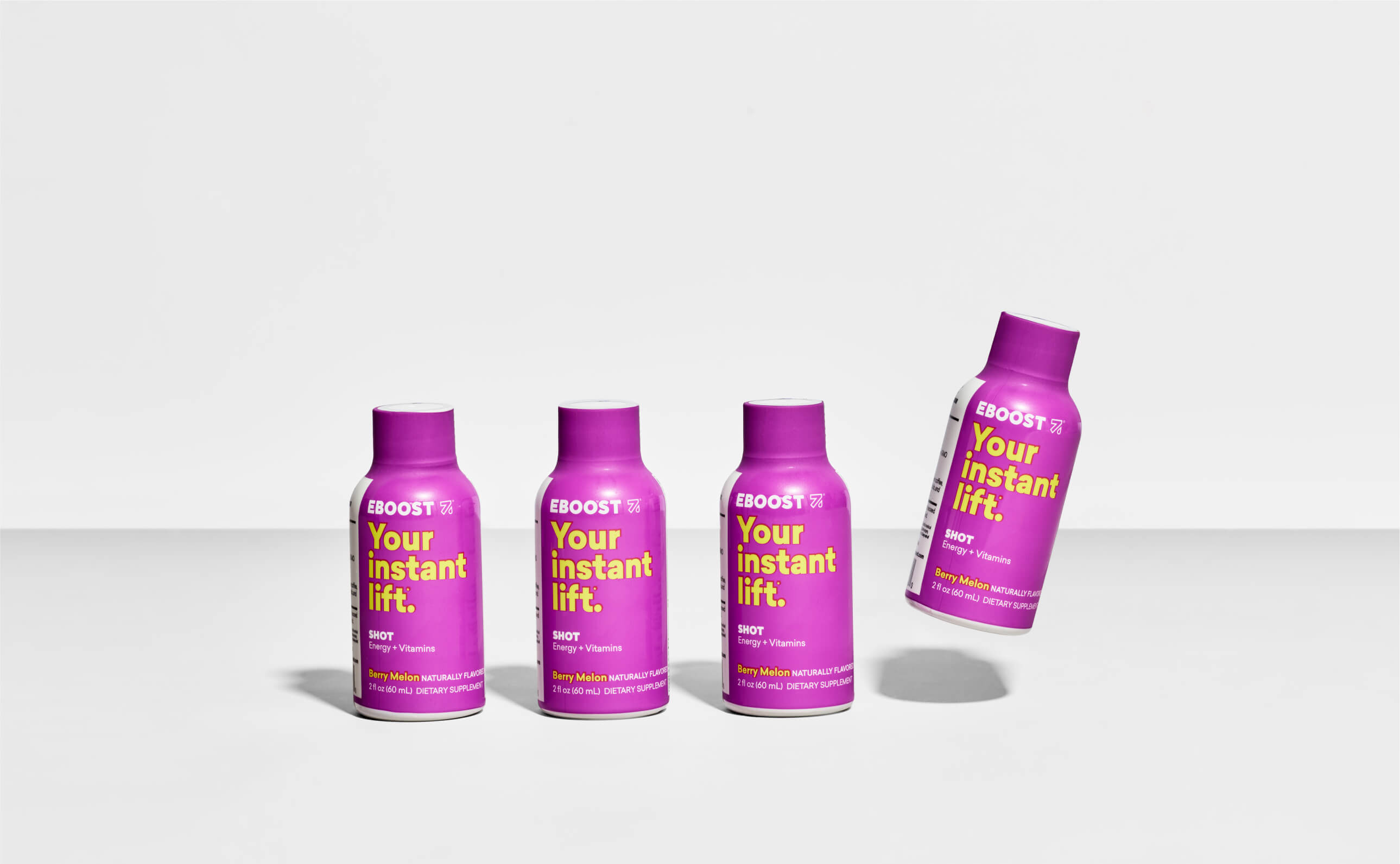
With bold, benefit-focused messaging, and a clear icon system, finding the right product for your needs becomes simple and fun.
With bold, benefit-focused messaging, and a clear icon system, finding the right product for your needs becomes simple and fun.
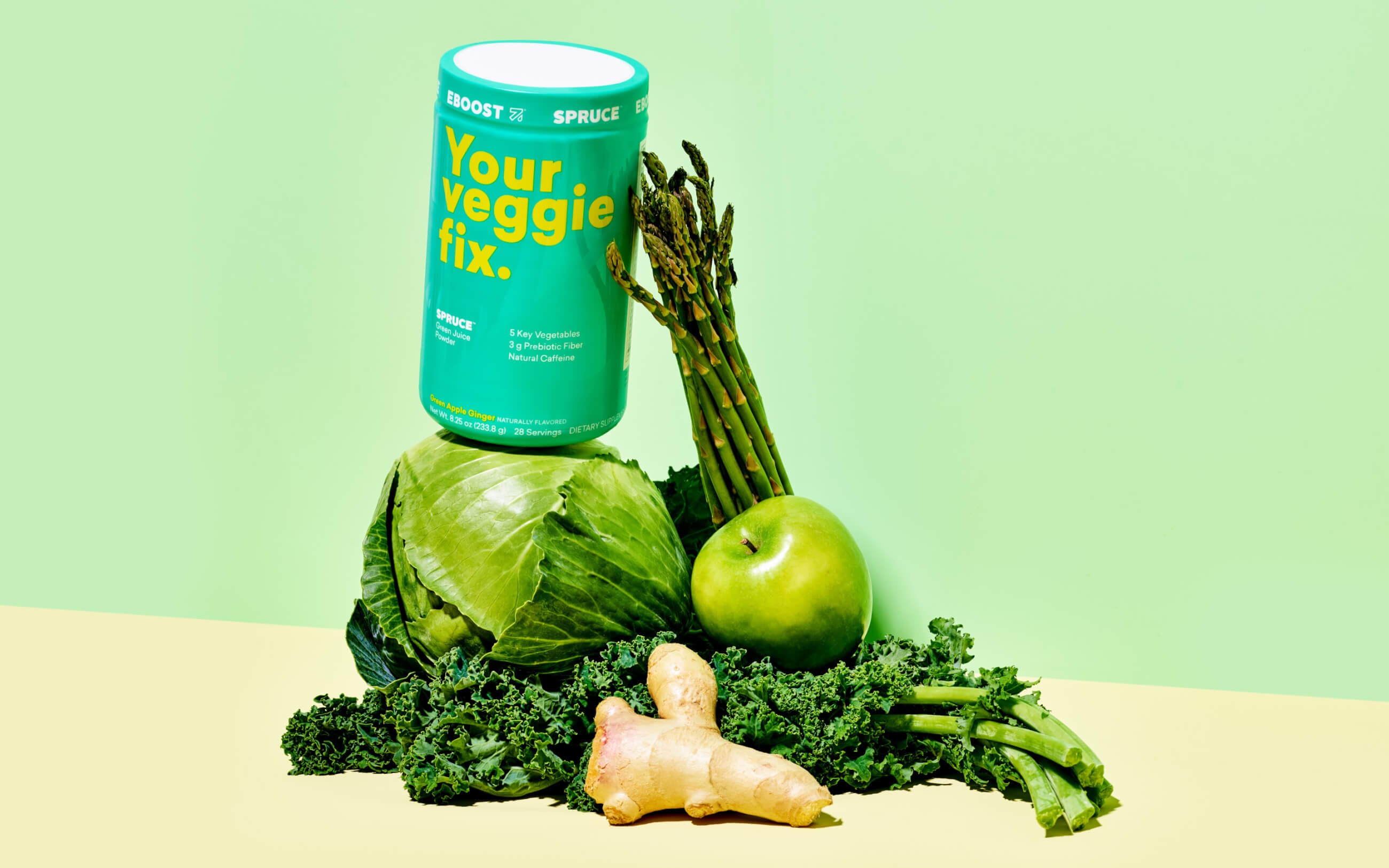

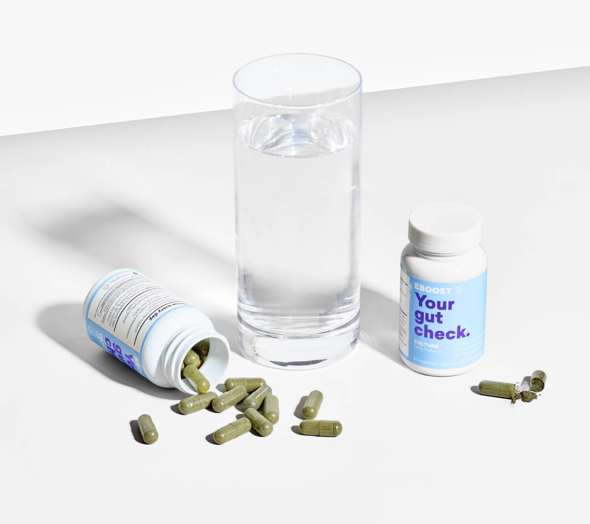

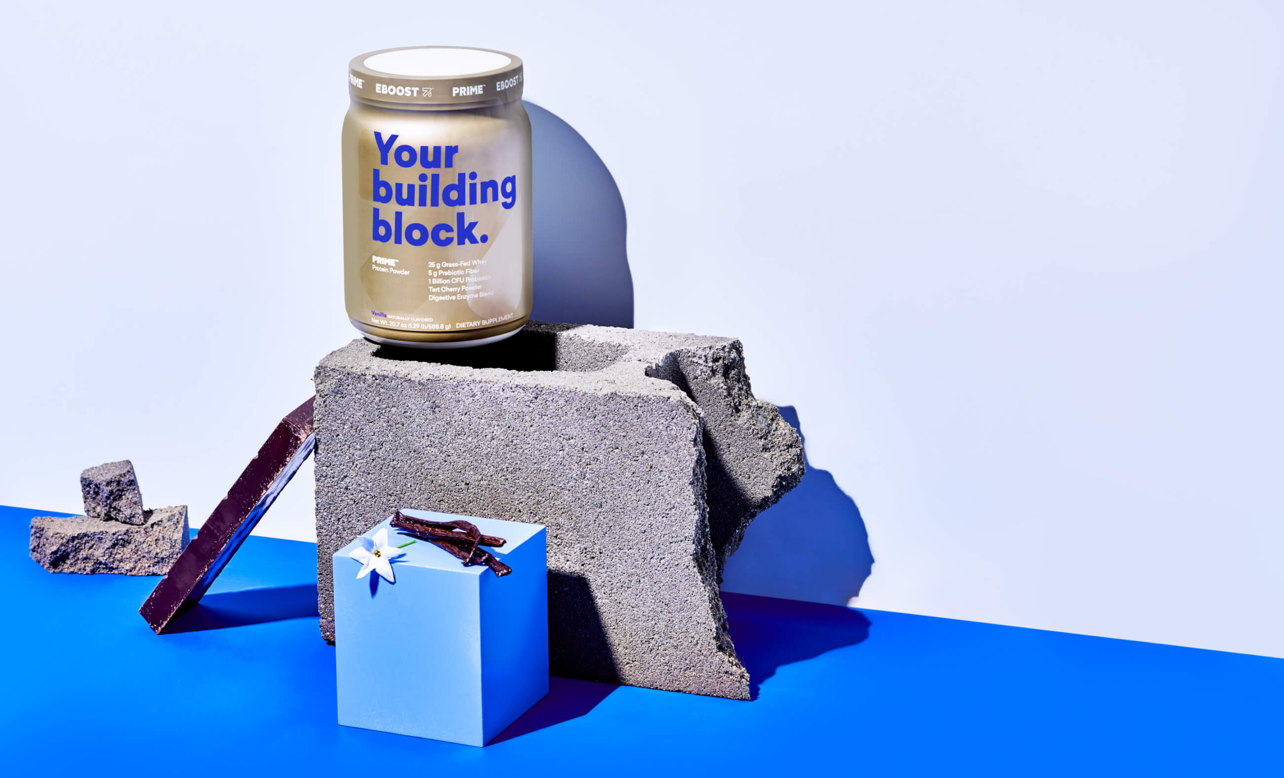
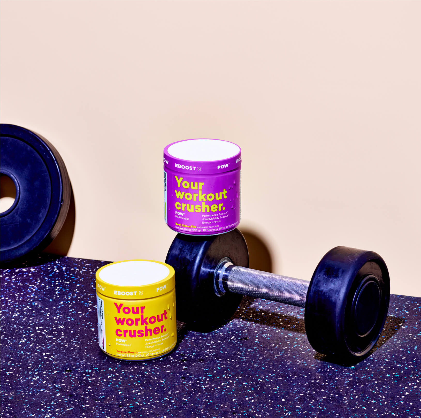
Tasty color combinations, sharp copywriting and energetic photography all combine to tell the story of Eboost’s clean fuel.
Tasty color combinations, sharp copywriting and energetic photography all combine to tell the story of Eboost’s clean fuel.
Take a gander:
How We Helped:
Strategy
Branding
Packaging
Product Photography
Web Design
Web Development
Who Helped Us:
Photography:
Evan Robinson
Styling:
Jenny Wichman
Photography:
Evan Robinson
Cocktails prepared by Stephen Palahach
Setting and furnishing provided by ANGL.
Photography:
Evan Robinson
Cocktails prepared by Stephen Palahach
Setting and furnishing provided by ANGL.
