MINNA
It’s Tea
Time
When Minna told us they were in the process of making a lightly brewed sparkling tea, we were hooked before we even tried it. When they went on to say they would be donating a portion of their profits to charitable foundations supporting inclusion, we were all in.
From there, we set out to create a brand that would float above the rest in an ever-deepening sea of sparkling beverage options. One that would be as unique and refined as the flavors Minna was brewing up.
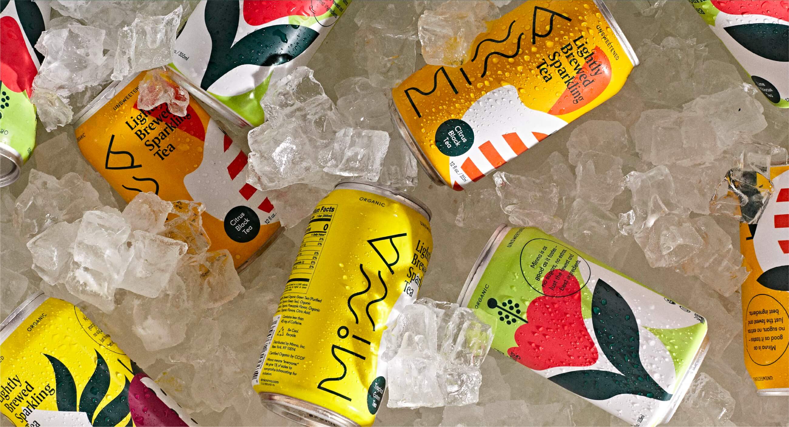
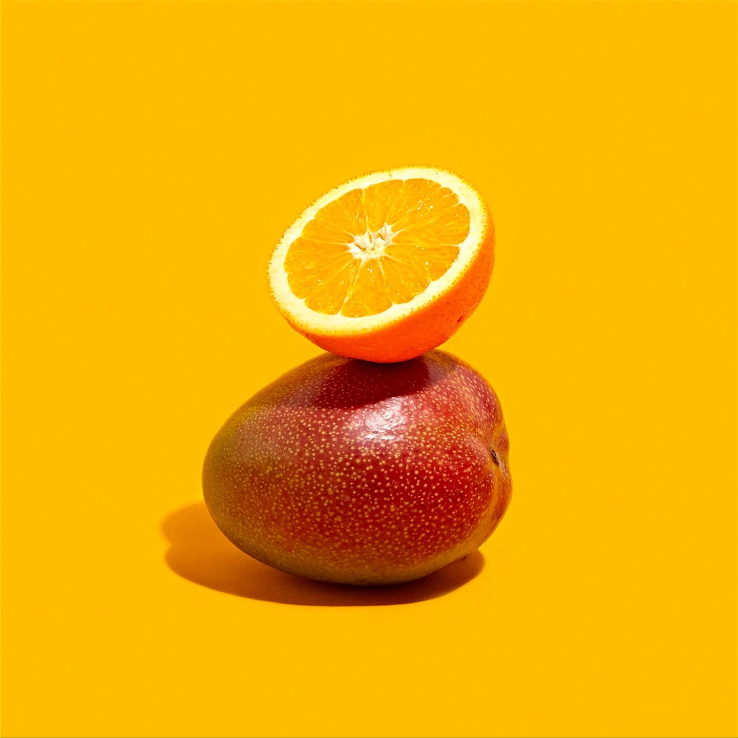
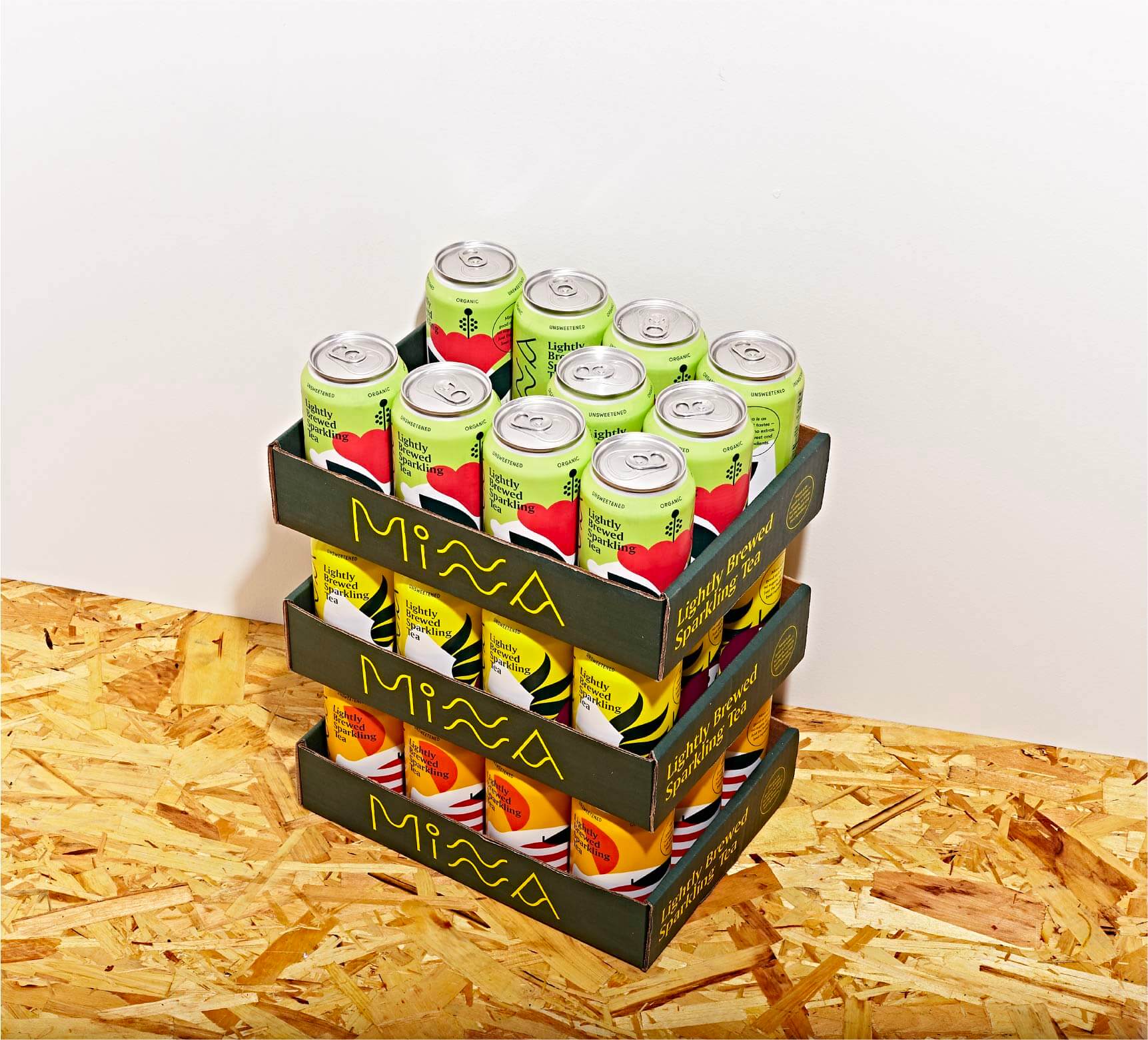
Just tea, organic fruit, and some bubbles. We thought the cans should be just as clean and simple.

Precise, sophisticated flavors needed to be supported by illustrations that hit the very same mark.
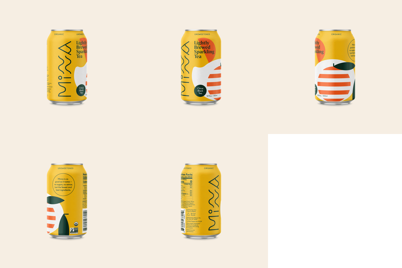

The word “minna” means “everyone,” so we created a branding system full of dynamic shapes, lots of color, and ample life.
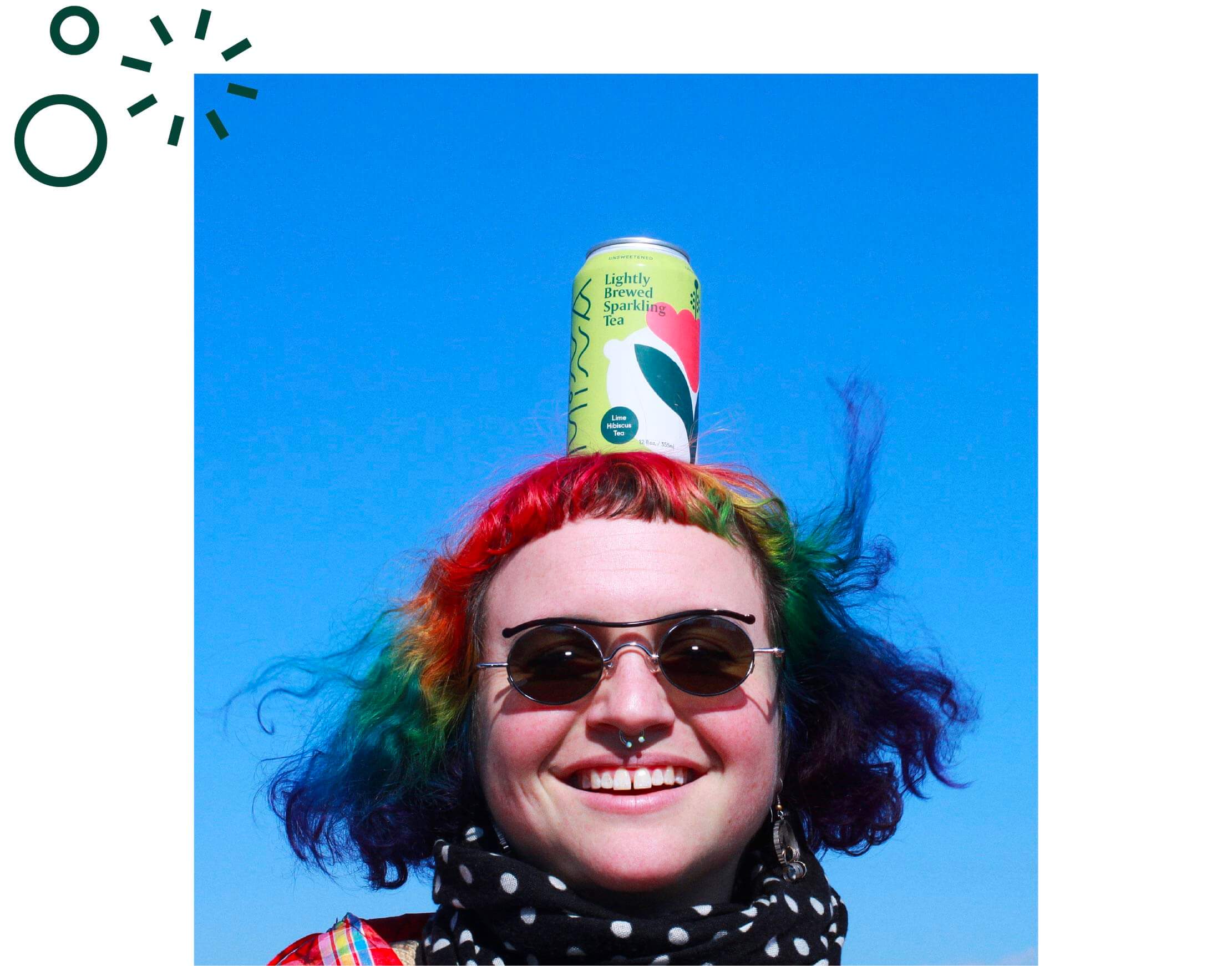
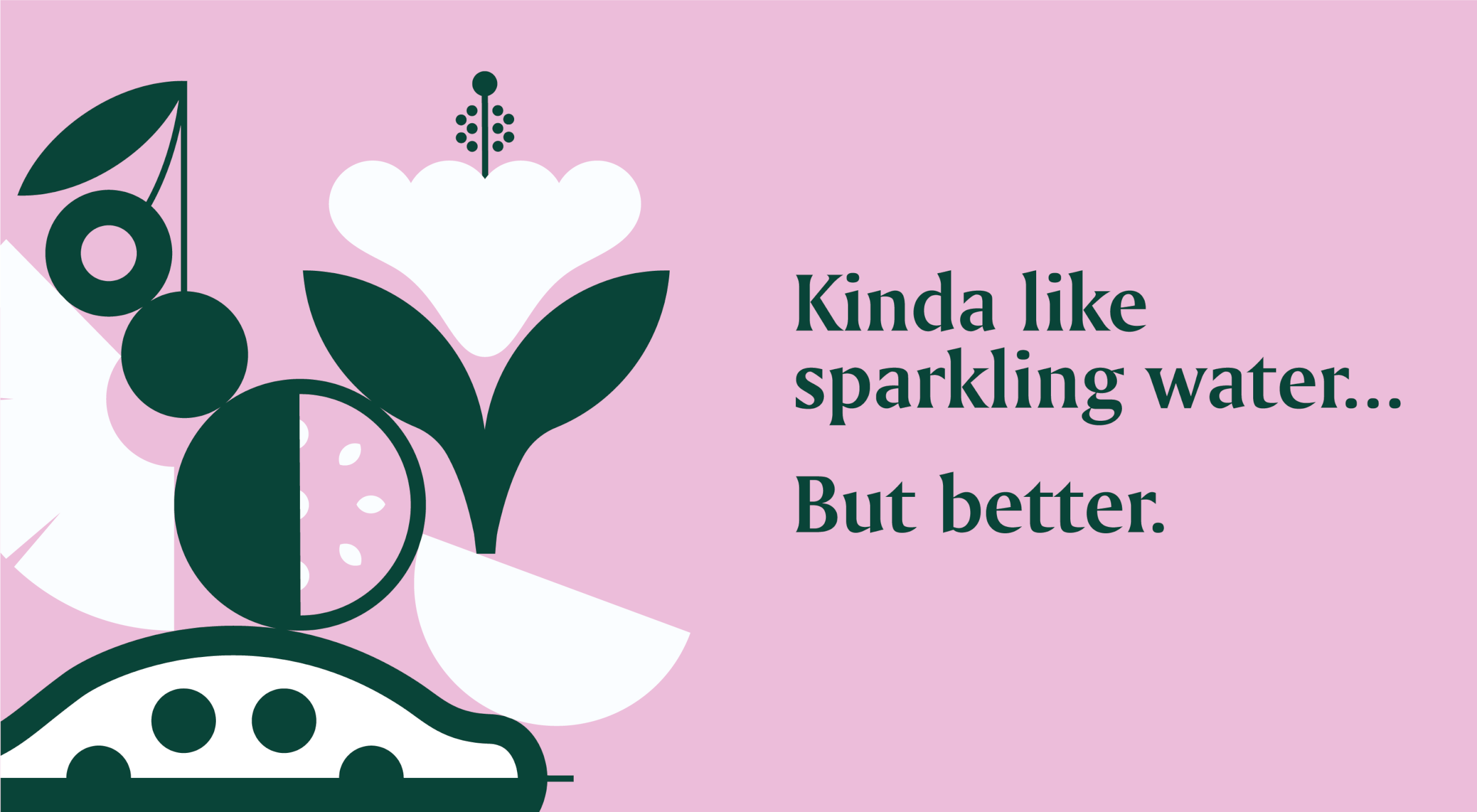

Take a gander:
Take a gander:
How We Helped:
